Sony Changing PS3 Box Art
I’ll readily admit that this weekend was a slow weekend in the gaming news sphere. I assume that’s because all the big sites were busy reviewing Titanfall. However, I did see this news item that I found interesting, albeit not earth shattering.
Very quietly, it appears that Sony is changing the design of the box art of PlayStation 3 games to keep it more in line with that of the PS4 and PS Vita. Gone is the greyscale top bar and in is the new Sony standard of blue and white branding.
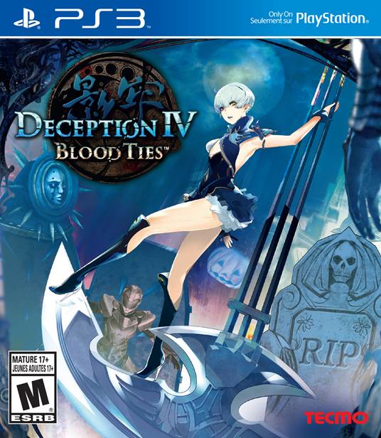
IGN first noticed this design change when they received the box are for Deception IV: Blood Ties. This included the new blue band at the top of the box. They reached out to Sony and found out that this was going to be the status quo going forward.
When Sony launched the PlayStation 3, the box art featured the PlayStation 3 branding as a vertical banner along the left side of the front cover in the same “Spider-Man” typeface used on the console.

Around 2009, Sony changed the box art layout to move the PlayStation branding to the top of the box in a new typeface and identifying the console as “PS3” rather than the full “PlayStation 3” name. The new PS3 logo made its way to the box’s spine rather than that red square.

Now, just as Sony has introduced their fourth-generation of PlayStation console, they’ve changed the box art again to keep in line with the new blue and white PlayStation brand colouring. It’s not a major change like 2009’s but somebody at PlayStation brand marketing thought this was necessary.
While the move isn’t anything newsworthy on any other day, it does give me an opportunity to remind you to make sure that you’re not accidentally picking up a game for the wrong console generation when you’re shopping in-store.
Source: IGN
Share this:

Posted on March 10, 2014, in Games and tagged PlayStation 3, PS3, Sony. Bookmark the permalink. Leave a comment.


Leave a comment
Comments 0